Questions & Answers
The following definitions are used in our pages:
By short term means 1-3 weeks. The standard charting period for a short term is typically three months (our current charts).
Medium-term is 1 - 3 months and the charting period is typically 12 months.
The long-term is 3-12 months, and the charting period is typically 18 months.
The reason the chart period is more extended than the definition, e.g., short-term 1-3 weeks while the charting period is three months, is to give a better view of the historical development. Indicators in the short term chart are based on a short term, e.g., Relative String Index (RSI) 14 is used for the short term and 21 for the medium term. The "length" of indicators is directly related to the speed of the signal—the shorter, the faster. But, and very important, the accuracy is higher with a more extended indicator period.
A score is an independent valuation of the technical picture for the stock based on several different indicators.
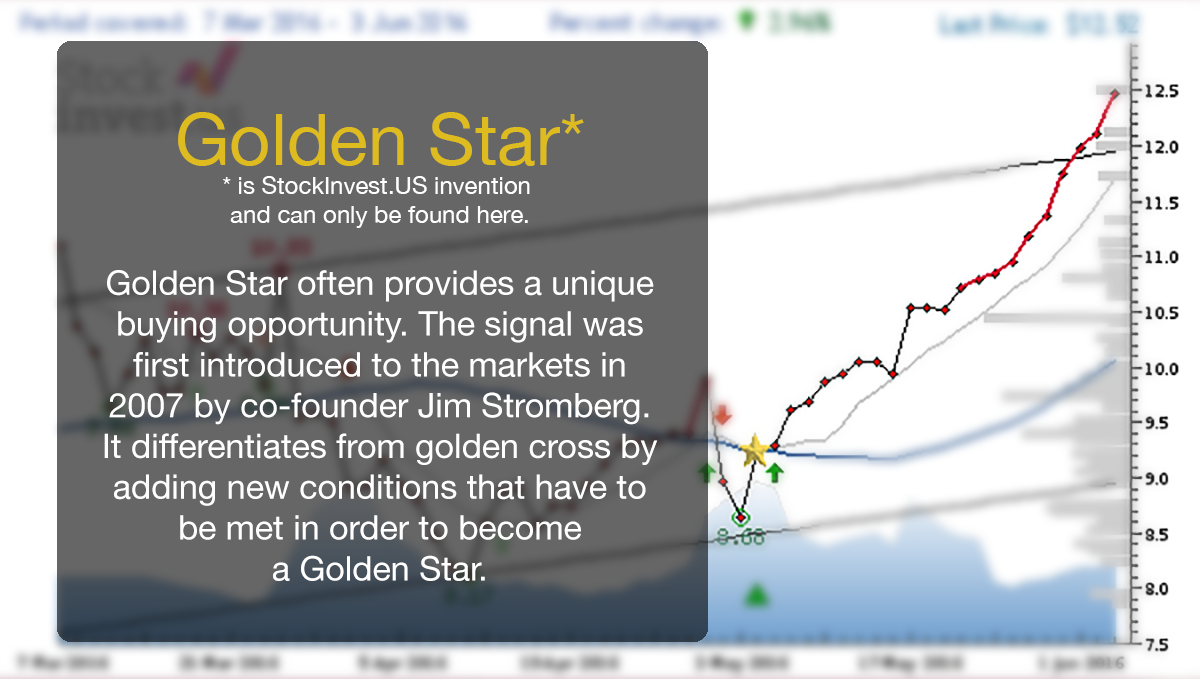
The Golden Star is a stronger version of the golden cross signal using moving averages as indicators.
A higher score indicates a higher probability for short-term gains. Golden Star can last anything from 3 days to 1 year, depending. The short-term score will always fluctuate. The combination of a high score and a Golden Star, therefore, indicates a higher short-term probability for gains, but it says nothing about the potential of the Golden Star.
We are trying to make the charts so intuitive that you can sense the next move just by looking at the chart.
Look at our site for tutorials to help explain the signals and charts.
In general you should look at the following when you predict:
1) What is the general movement?
2) Is there much resistance or support at current level
3) Is stock overbought or oversold ?
4) Is volume following price?
A stock that has moved many days in one direction is likely to take a break or change direction for a few days. Early signs are divergence in volume or stock facing support or resistance. The predicted change should reflect the volatility in the stock. Do not expect a slow mover to move 8% unless there is some special news.
Score is an evaluation from -10 to 10 based on the system we've developed to recognize and evaluate several technical indicators like moving averages, trends, volumes, pivot points, RSI and others. These indicators are then run in our algorithms for the final result.
Evaluation:
From -10.00 to -5.00 indicates 'Strong Sell'
From -4.99 to -1.00 indicates 'Sell'
From -0.99 to 0.99 indicates 'Hold'
From 1.00 to 4.99 indicates 'Buy'
From 5.00 to 10.00 indicates 'Strong Buy'
In most cases, we try to adjust the split at the same day, while dividends are adjusted on data clean up. (When reloading/cleaning data)
The dividend itself is no technical indicator, but it skews the price picture as all previous prices should be adjusted accordingly. The changes affect trends, scores and other indicators.
There has been a discussion amongst chartists, that whether or not it's correct or incorrect to change the history for dividends. Imagine this:
A Stock is at 51.50 USD. A dividend payout puts it at 49.50 USD. Big round numbers are - resistances, especially if they're with an attempt to break it. The magnitude of 50 is (after dividend adjustment) not particularly big. 50 has been broken before and the majority of traders know this. Furthermore, a dividend payout is also a reduction of the company’s actual value (by taking money out of the company). Is this significant and should it be visible? (un-adjusted) or should the chart show the price as like nothing have happened?
In our opinion, you can stand to interpret big indicators like Volume incorrectly, if you don’t adjust for dividends. But on the other hand, the impact of dividends, as such, are usually inconsiderable.
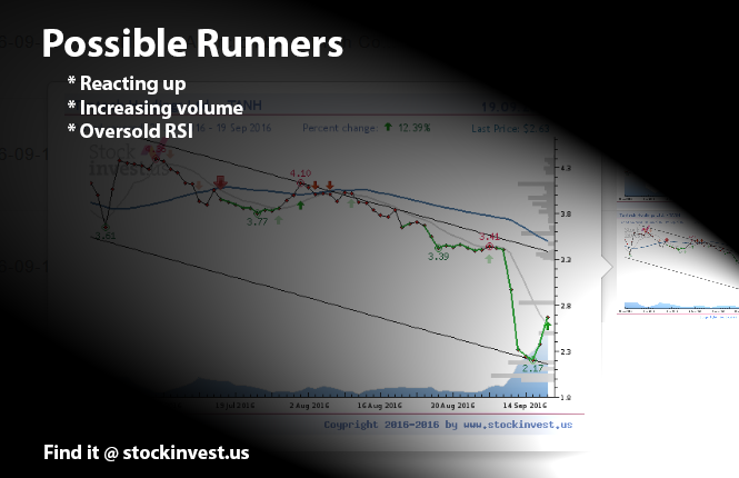
Stocks that are listed in the possible runners list - are stocks, which currently are oversold on RSI 14 day period. They have found a pivot bottom and are going up on increasing volume. As in any other list these are some options - some may perform great and far, while some will not perform at all. Penny stocks, or stocks that traded under 1 USD, often behave erratically. In order to see the real potential of the run you should first look for the nearest resistance level, this will often define the first stop and a good selling point. Since these stocks have high volatility you have to monitor them closely. What goes up often goes down as well. Or as others like to say it: "Easy come, easy go..."
"
Stop-Loss is the level where you will sell your stock if it starts falls down. Most brokers offer this as an automatic selling option in their systems as long as you set the limit. The stop-loss should be floating, which means that if the price goes up, you should adjust your stop-loss to other levels. Some keep a rigid system where they, for example, use -5% to calculate their stop-loss. This is easy to set, but it doesn't not take into consideration the fluctuations (volatility) that some stocks have during the intraday. We recommend to set the stop-loss based on your time horizon, risk, and volatility. You can use percentages or look at the support levels and add a safety margin. If the stocks fall below those supporting levels, occasionally it will fall even further. Some traders like to use trends to their advantage, but make sure you give this level some slack. Amongst devoted people that uses technical analysis as their decision tool, all major signals should be verified by +/-3% margin. To illustrate this: if a trend is broken, it must be confirmed by the falling 3% below the trend line. Same goes for pivot points, accumulated volume etc.
Selling a stock, commodity or currency is way harder than buying it. Naturally, we always hope for more profit or to get back some of our losses. A strong stop-loss strategy will save you a lot of money. If a stock is sold because of the stop-loss you can still buy it back, perhaps at lower levels where you own more shares (accumulation).
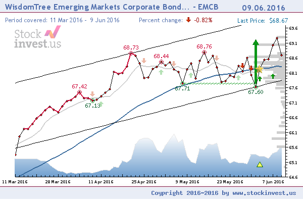
If a stock turns in the bottom of a set trend, it is always a good signal. If a stock turns in the middle of a trend it can be a signal about a forthcoming trend fluctuation. If you want to buy in the middle of a trend, it all comes down to your own strategy plan. Whether you are aiming for the short term or the long term? If it's for the short term, then volume, support and resistance are of higher importance.
The chart below illustrates the given question thoroughly. In this case, WisdomTree is in the middle of the trend. The high levels of support just under current price indicates a possible good buy opportunity.
.
 Moving average
Moving average is a widely used indicator in technical analyses that helps smooth-out the price action by filtering out the “noise” from all of the random price fluctuations. A moving average (MA) is a trend-following or lagging indicator, because it is based on all former prices. The two basic and commonly used MA's are - the simple moving average (SMA), which is a simple average of security over a defined number of time periods, and the exponential moving average (EMA), which gives more weight to the most recent prices. The most common applications of MA's are to identify the trend's upcoming direction and to determine the support and resistance levels. While MA's are useful enough on their own, they also form the basis for other indicators, such as - the Moving Average Convergence Divergence (MACD)
1) For the long-term - we use the standard 100 and 200 days moving average. (Dark Blue line)
2) For the short-term we use dynamically Moving Average that is being calculated upon the number of days in the chart. (Grey line)
Explanation:
Using a dynamically calculated Moving Average is the correct approach, even though many swear to the standards of 4, 7, 8, 9, 12, 15,
18, 21, 23, 26, 27, 29, 32, 35, 100, 200 based on standard 1,3,6,12,24,48 and 96 months charts. But what happens with charts not having the full length of their changes history?
Mathematical solution:
Moving Average = ((Num of days / 5) / 2) + 1
Example:
3 MND equals approx. 66 days of history
Moving Average = ((66 / 5) / 2) + 1 => 7.6 (Equals 8 days of moving average)
1 year equals approx 264 days of history
Moving Average = ((264 / 5) / 2) + 1 => 27,4 (Equals 28 days of moving average)
Using dynamic approach to set, the correct Moving Average length for short-term shows that it's particularly useful when dealing with charts that don't have full set of historical data.
.
The pivot that's listed in the support and the resistance is the pivotal point between the last days of high, low and closing prices. It is calculated with:
((High + Low + Close) / 3).
Given the example of a stock that ended with 50 USD the last day, it was traded as low as 47 and as high as 51. The pivot's then: (51 + 47 - 50) / 3 = 49,3. This indicates a high chance for an opening, if it's lower than yesterday’s closing price - it's explained by the market psychology that this is the breaking point between buyers and sellers. For many traders, the pivot is not representing the opening price, but next day’s best buying level. It's more reasonable as progresivelly people use automatic bots for trading.

The 'Death Star' is a strong technical sell signal that appears if the moving averages cross each other in a certain pattern that are on the price line. The signal needs to be verified that it has appeared by the last 2 days that were in the executive trading days. The delay in the signal is often within a 1-3% range (change of price after it occurs), but our backtesting shows that a stock with these signals will most certainly fall for a long period and deep down. It is important to notice that when the signal has weakened in stocks that have low volume and wrong signals, they will appear more often.
*Golden Star is a technical signal that was first introduced in 2007 by J.Stromberg at the website getagraph.com. The signal derives from the well known 'Golden Cross' that uses 50 or 200 days of moving averages to define, what has been argued by many, what was the best technical signal out of them all. Backtesting proves actual strong results on the signal which has a delay of 2 days.
The 'Golden Star' signal differs from the 'Golden Cross' by adding more conditions for the signal to appear. For instance, the moving averages have to be selected based on the time frame that was selected. In addition, it has to cross the price line at a given pattern as shown below.
Yes! User registration is free of cost and there is another option that you can sign in with your Facebook account. Don't forget to read the Terms of Use and Privacy Policies to make sure that you don't break the rules!
Why is volume important ?
There are many reasons why volume is important. Volume is an expression for liquidity, and liquidity is an expression for a turnover. In common terms, this boils down to the amount of shares traded per day.
Ill-liquidity and risk
If in comparison there're fewer trades that day, the stock becomes ill-liquid and the risk increases as you might not get to buy or sell at that time.
Volume as an indicator
Volume indicates how many investors are interested in the stock. If volume increases - it means that there is a higher demand for the stock, and the opposite if the volume falling. In basic terms - the volume should follow the stock. This reduces the risk and makes the predications/assumptions more credible. (e.g. if the volume rises you can expect a price rise as well)
Volume is amongst the most used tools in technical analysis like buy/sell strategies.
1) For the long-term - we use the standard 100 and 200 days moving average. (Dark Blue line)
2) For the short-term we use dynamically Moving Average that is being calculated upon the number of days in the chart. (Grey line)
Explanation:
Using a dynamically calculated Moving Average is the correct approach, even though many swear to the standards of 4, 7, 8, 9, 12, 15,
18, 21, 23, 26, 27, 29, 32, 35, 100, 200 based on standard 1,3,6,12,24,48 and 96 months charts. But what happens with charts not having the full length of their changes history?
Mathematical solution:
Moving Average = ((Num of days / 5) / 2) + 1
Example:
3 MND equals approx. 66 days of history
Moving Average = ((66 / 5) / 2) + 1 => 7.6 (Equals 8 days of moving average)
1 year equals approx 264 days of history
Moving Average = ((264 / 5) / 2) + 1 => 27,4 (Equals 28 days of moving average)
Using dynamic approach to set, the correct Moving Average length for short-term shows that it's particularly useful when dealing with charts that don't have full set of historical data.
A great question is how to calculate RSI?
The math
The math is pure and simple. It requires just a casual overlook at the changes from time to time for a given period. Let's say, that the time period is 14 days. Summarize all of the positive changes and all of the negative ones and put it in this formula shown below.
RSI14 = 100 x (pos-change / (pos-change + neg-change))
The main question
In any case, making RSI calculation is close to no effort. But for the Low- Liquid stocks you will be phased with the following question:
- Will the days that have no volume will be counted???
Our rational thought about this issue
There might be days for a lot of stock that their price will not change by the end of the day. It means that a day without trading is a day without change. This should be have reflections in the RSI calculations and therefore all of the days should be counted, if stocks were traded that day or not. Stocks that are being low in trading are imposing a risk anyway, and any use of the technical analysis is weakened in such cases.

 There's more than one definition of RSI, but most often it's defined as:
"The Relative Strength is measured by looking at the daily positive and negative changes"
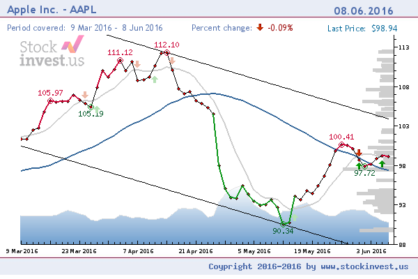
In natural terms, you can say that RSI is being measured if a stock is getting over-sold, overbought or just staying in the middle. It's done by tracking the stock for how many days it has been rising or falling in a given period of time. For example - If a stock has been in the gaining side for too long, there's a lesser chance that it will take a break. To visualize the increased risk, our charts are colored with a red line. This line doesn't mean that you must sell right away, but it just means that to watch it even closer. Some stocks go very high, while being over-bought on RSI, like the stock shown below. Over-sold is colored with the green colour. In most cases, RSI is calculated for 14 or 21 days, depending on the charting period.

There has been an ongoing discussion if MACD divergence is accurate or not as a trading strategy. The idea behind all the divergence trading is that the divergence is one of the first signals about an incoming change. A falling MACD (after topping out), while the price is still rising, indicates that the price will fall down soon. This is a problem when the stocks have little volatility or move sideways.
The Fan Theory was first described by W.D.Gann and the definition of Fan Theory is:
The Gann Fan is made out of nine angles based on this concept. These trend lines are used to indicate support and resistance levels. When one of the lines is broken (by the entire days price range) prices should move to the next line. The drawing of these lines should start from either a market top or bottom.
You can find more information here:
http://help.geckosoftware.com/40manual/new/advchart_tools/gannfan/gann_fan.htm

Pivot Points
Pivot Points, or significant tops or bottoms, as it really is, are generated if special conditions are met. We need to take into consideration several factors - Volume, RSI, Patterns that indicate that the stock has risen, Trends and naturally there has to be retraction after a gain in order to properly identify a top (and opposite for a bottom). The retraction cannot be simulated, and due to the fact that it has to happen, it causes a delay for this signal. Approximately a 2 day delay. Statistically you would lose 1-3% of the signal due to the delay.
We use self-developed algorithms to identify those Pivot Points. As a general rule of thumb: the signals are weakned if stocks are traded on low volume (ill-liquidity), and the chance for false signal increases.
We do not give direct advice on what you should do with your shares. We look at the technical picture and not the fundamental picture. (assuming that TA's every information is correct). If the TA (Technical Analysis) gives signals to buy the stock, then it indicates that more people will positively buy and push further the stock.
If you are scared losing shares due to fundamental causes (fear of bankcruptcy or other real-life events), there are news coverages for every stock in the technical analysis page ever since we have declared partnership with CityFALCON.
It all comes down to timing. Some stocks potentials are taken out in the early stage, while some keep the stock without selling for a longer period of time. A huge percentage of the predictions return 2-5% from the buy signals until it goes to hold or sell phase. Currently, about 50-55% return between 5-10% and almost 15% return more than 10%.